At our creative design agency, we had the privilege of collaborating with Swapit.ng, a revolutionary digital platform that facilitates the exchange of goods and services without cash transactions. Our objective was to create a unique and captivating brand identity that effectively represents Swapit.ng’s mission and vision.
The resulting branding package included a thoughtfully designed logo, a vibrant color palette, distinctive typography, and captivating brand collaterals. Join us on a journey as we delve into the creative process and showcase the elements that make Swapit.ng’s brand identity truly exceptional.
Logo Design
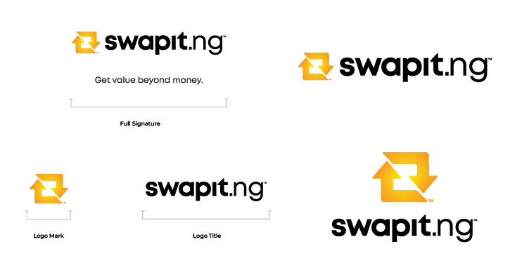
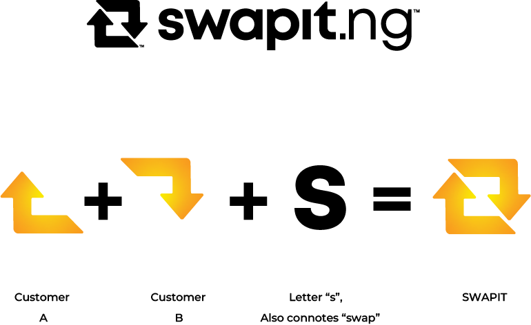
By aligning the arrows in a clockwise movement, we evoke a feeling of continuous barter and progress. The negative space within the arrows cleverly forms the letter “s,” representing the brand’s core action of swapping. The logo reflects Swapit.ng’s commitment to fostering a community where excess becomes an asset and waste transforms into wealth.
The foundation of Swapit.ng’s brand identity lies in its captivating logo. We aimed to capture the essence of value exchange and convey a sense of growth within an ecosystem. The logo mark features two directional arrows artfully positioned to depict the exchange between customers
Color palette,
Typography and
Pattern

To mirror the welcoming, trustworthy, and contemporary energy of the brand, we carefully selected a vibrant color palette. Deep orange, white, and bright yellow form the primary colors, exuding warmth and vibrancy. In addition, we created a gradient that seamlessly blends these three colors, symbolizing the fluidity of value exchange on the Swapit.ng platform. The color palette evokes a sense of positivity, trust, and approachability, setting the stage for engaging user experiences

We chose typography that complements Swapit.ng’s brand identity, effectively conveying its message across various touchpoints. Mont, a versatile typeface, takes the lead as the primary font. It is used for the logo, taglines, and headlines, providing a bold and modern aesthetic
The secondary typface, Roboto, enhances readability and serves as a perfect companion for subheadings, body copy, and captions. Through the harmonious combination of Mont and Roboto, we ensure consistency and clarity in all brand communications


Drawing inspiration from the directional arrows in the Swapit.ng logo, we created a distinctive pattern that further reinforces the brand identity. This pattern features an array of the two arrows, symbolizing the constant flow of exchanges on the platform. The pattern adds a dynamic and engaging visual element to brand collaterals, unifying the brand experience across different mediums
Brand
Collaterals
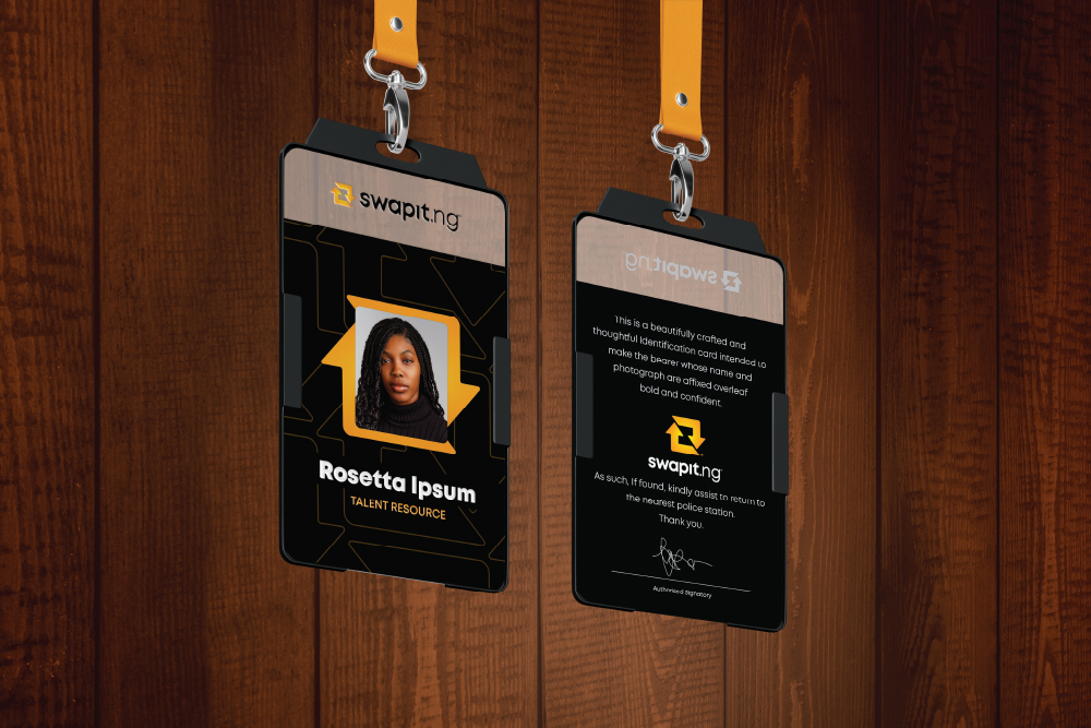
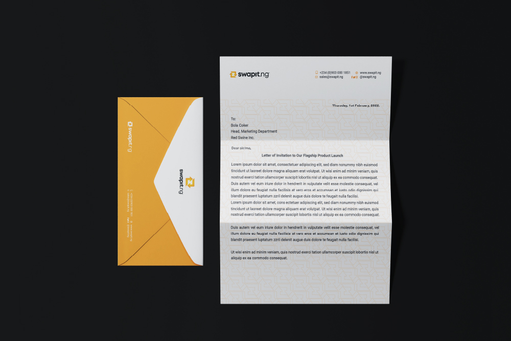
To extend Swapit.ng’s brand identity beyond the digital realm, we designed a range of captivating collaterals that convey the brand’s essence in tangible forms. The translucent PVC business card and ID card exude a modern and professional feel while showcasing the brand’s visual elements. The letterhead and envelope feature the logo, typography, and pattern, ensuring consistent and impactful communication.
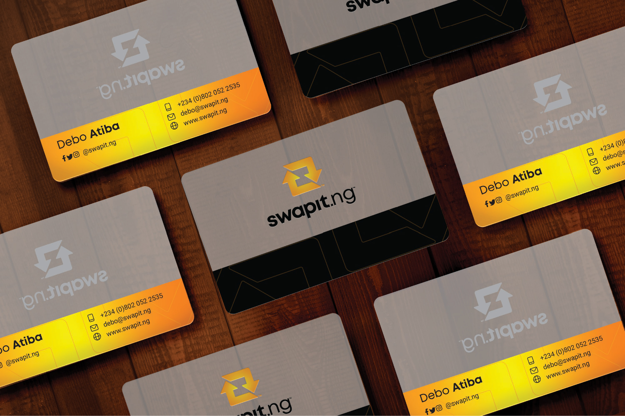
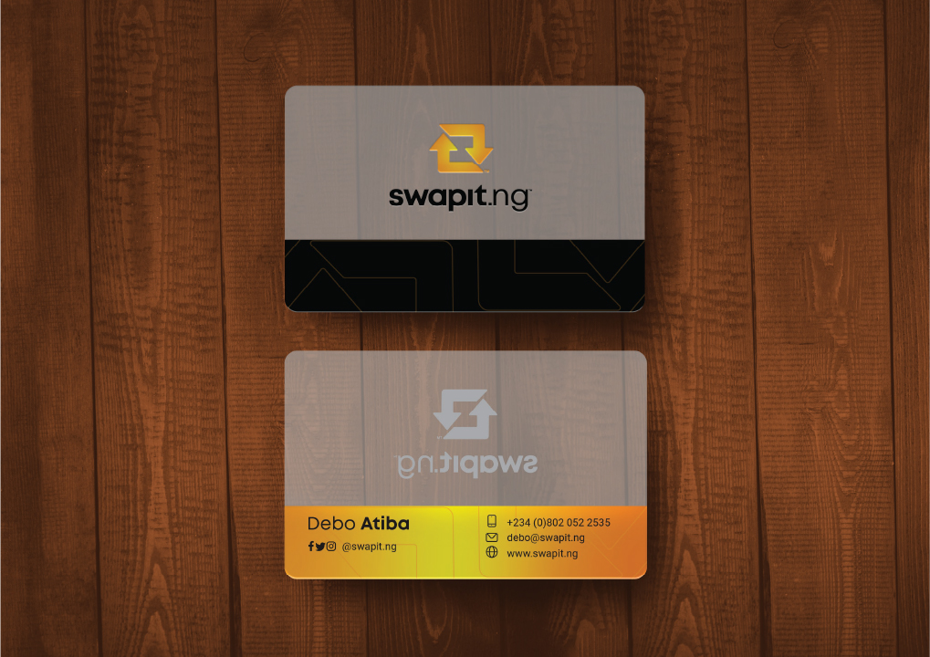
The translucent PVC business card and ID card exude a modern and professional feel while showcasing the brand’s visual elements. The letterhead and envelope feature the logo, typography, and pattern, ensuring consistent and impactful communication.
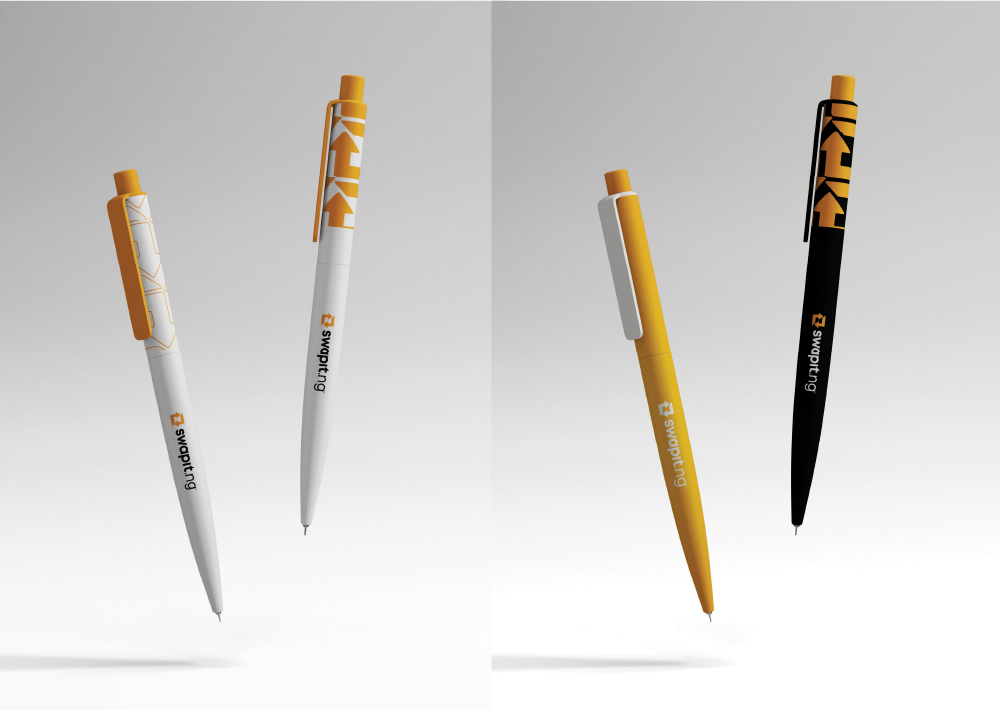
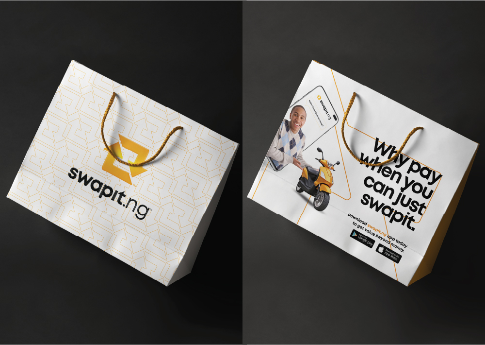
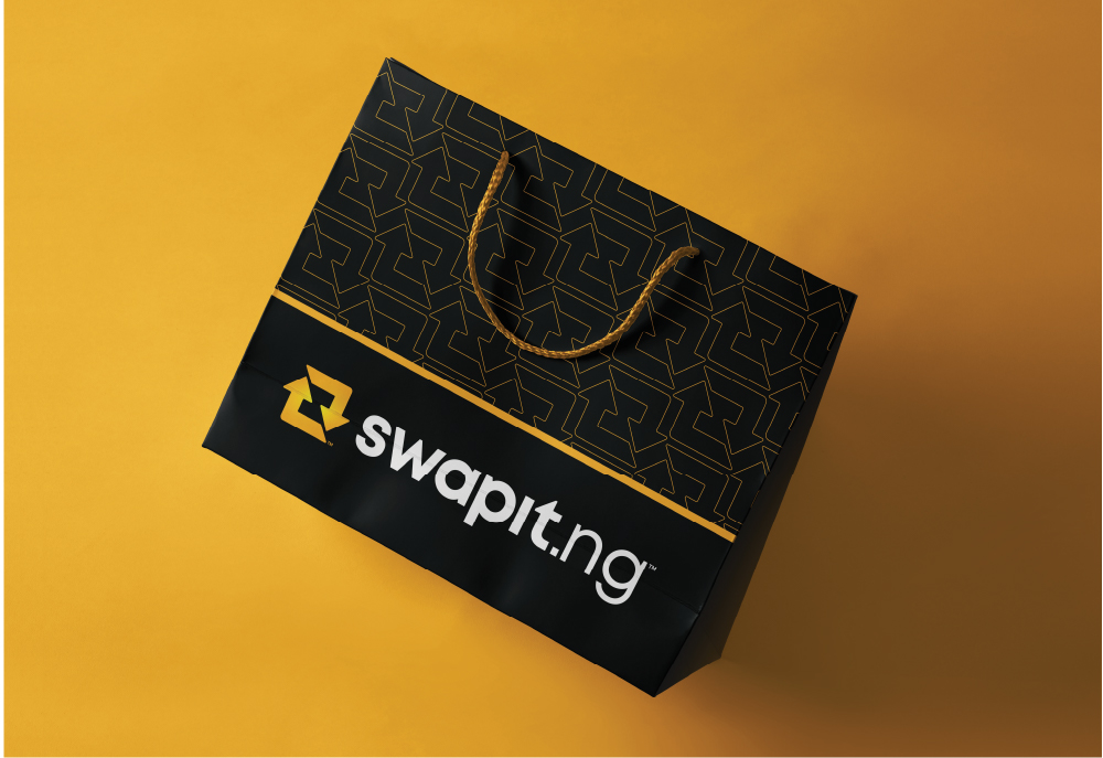
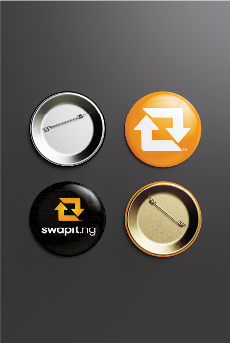
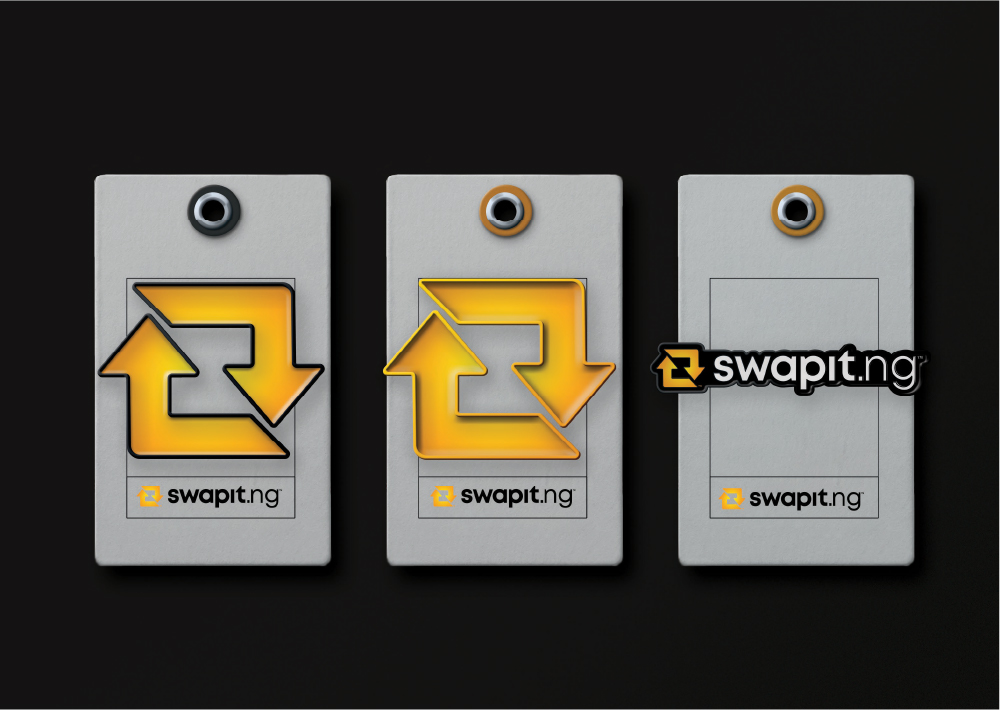
In addition, we created custom stationery items such as pens, chest pins, keyholders, and a paper bag, enabling Swapit.ng's brand to be present in customers' everyday lives.

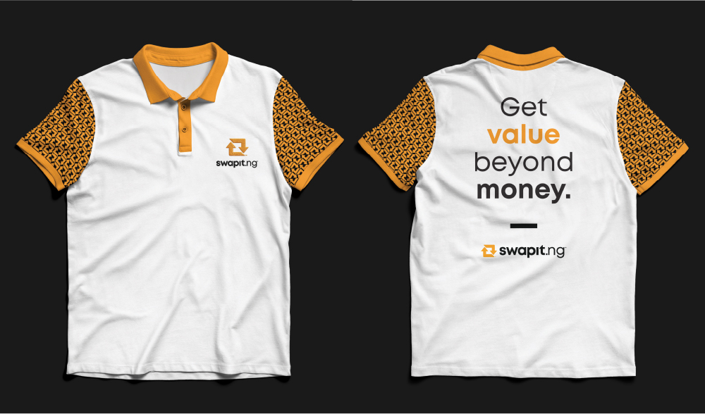
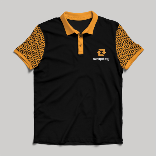
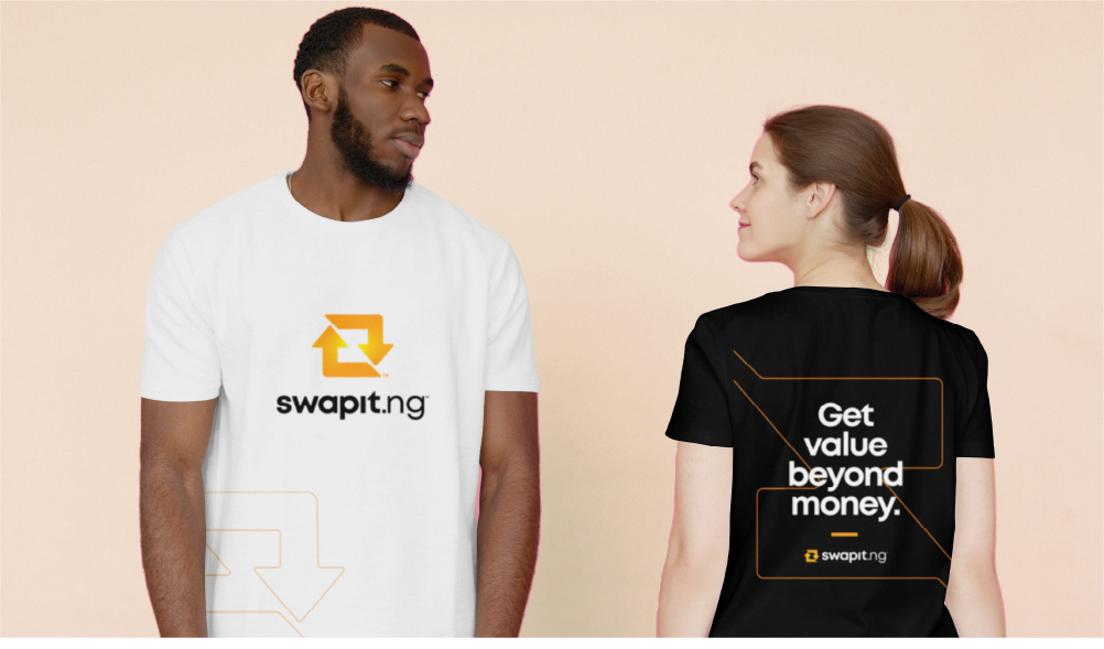
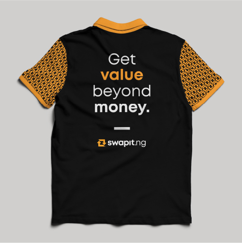
The T-shirts serve as walking billboards, spreading brand awareness and fostering a sense of community among users.
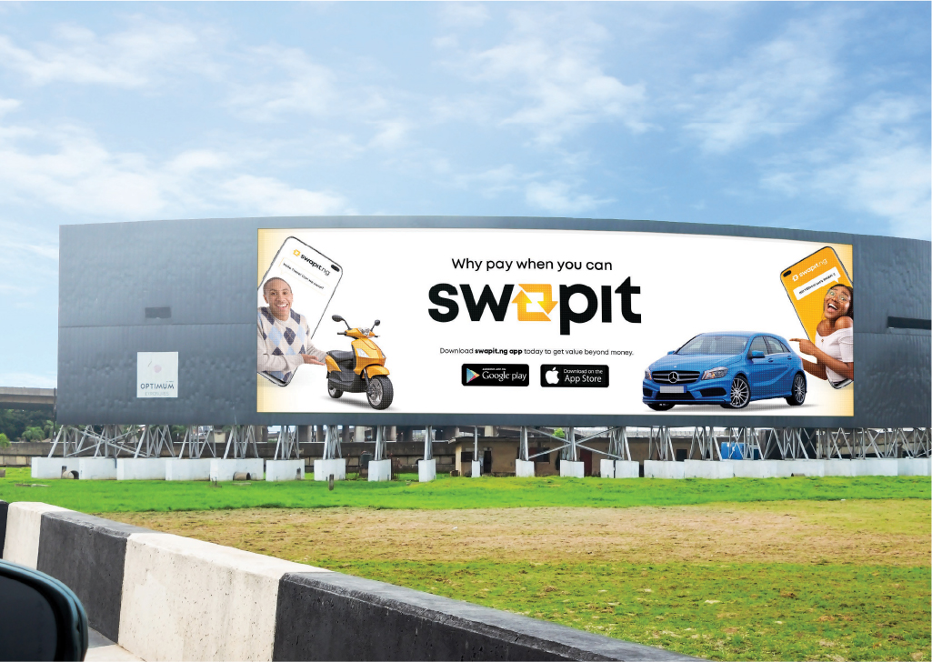
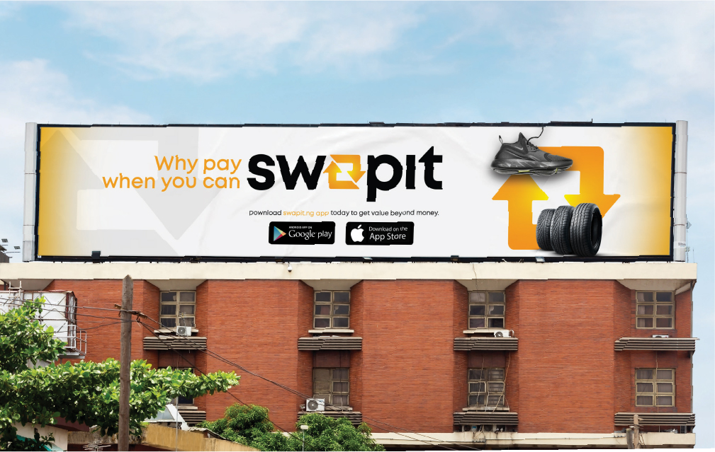
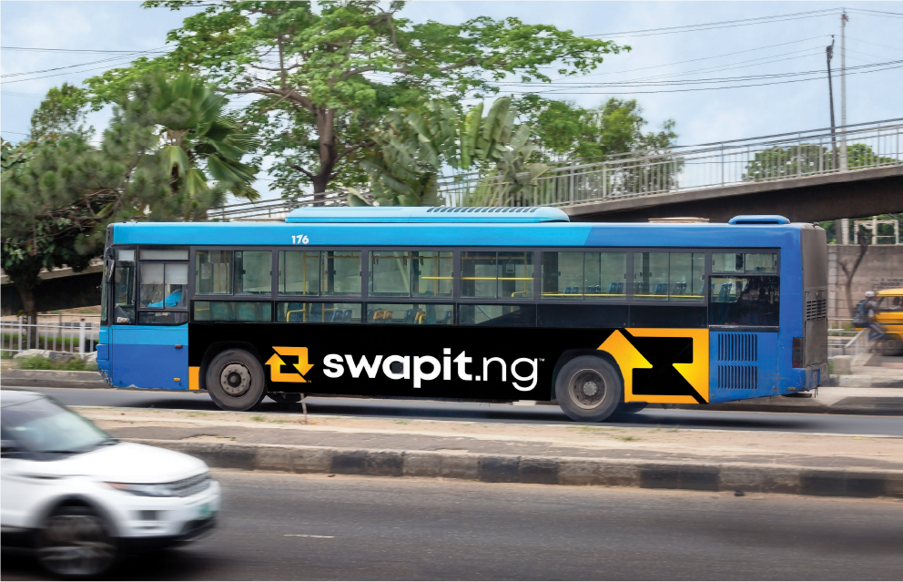
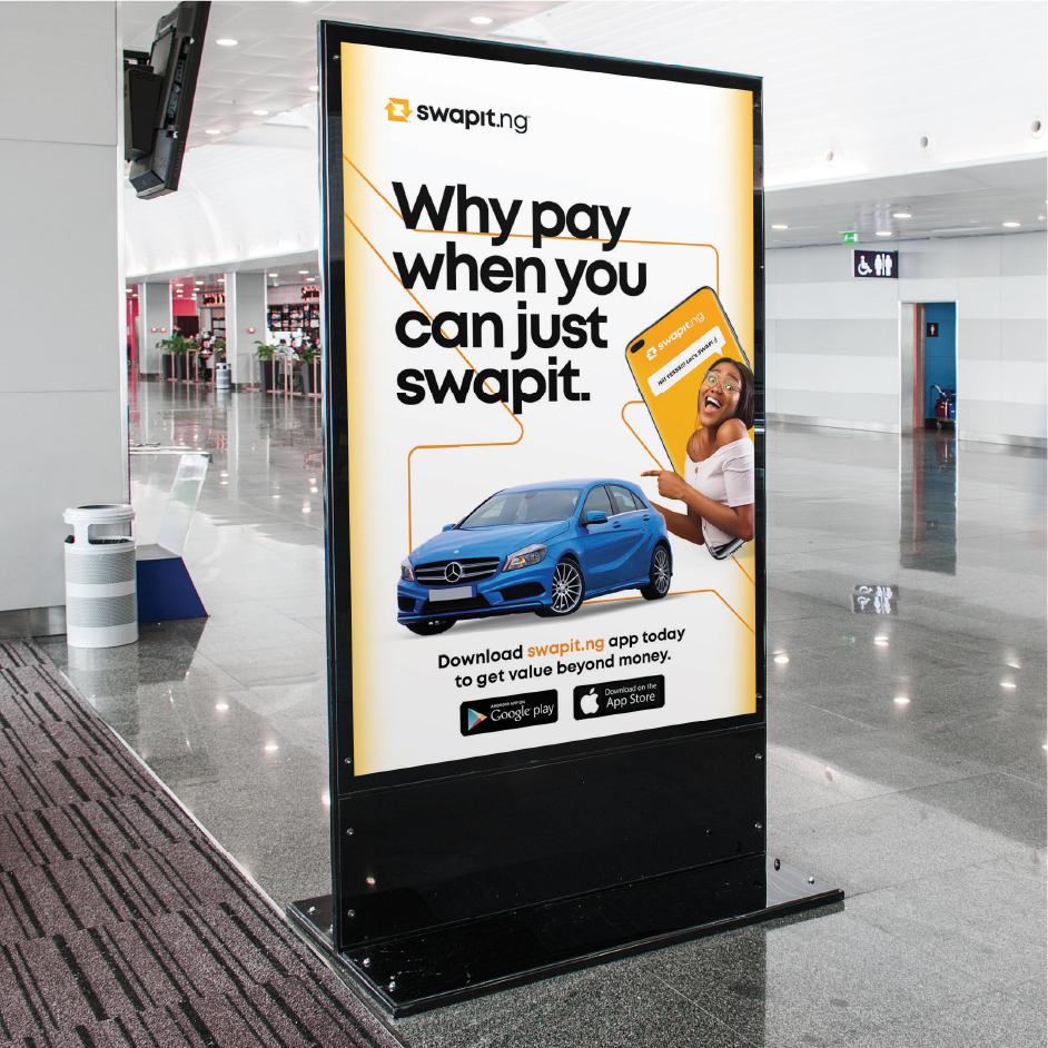
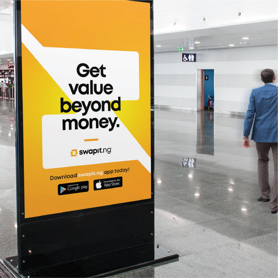
Speaking of billboards, we designed eye-catching outdoor advertisements that seize attention and communicate the brand’s message effectively.
