At our creative design agency, we had the opportunity to work with House of Solace Spices, a prominent spice and herbal brand that specializes in providing authentic African taste through their range of natural spices. Our task was to create a comprehensive brand identity package, including a logo, poster, flyer, business cards, spice menu design, and Ziplock pouch for their spices.
This case study highlights our approach, design process, and the final deliverables that reflect the essence of House of Solace Spices.
House of Solace Spices is committed to delivering exceptional culinary experiences with their carefully selected herbs and spices, tailored to the preparation of authentic African cuisine. They take pride in their all-natural products that contain no extra additives, ensuring the highest quality and purity. With their tagline, “Experience the real African taste,” they aim to captivate the palates of spice enthusiasts and food lovers.
Logo Design Process
When designing the logo for House of Solace Spices we were not only aiming for a logo that was aesthetically pleasing but we made efforts to create one that would leave a lasting impression on the brand identity of House of Solace Spices, to create a visually impactful logo. The logo design was coined from roots and herbs to form a “house” illustration with bold script typography for “Solace Spices.”
The color palette was carefully selected to represent the brand’s natural and vibrant qualities, with the green gradients symbolizing freshness and red representing the rich flavors of spices House of Solace Spices provides.
Brand Collateral Design
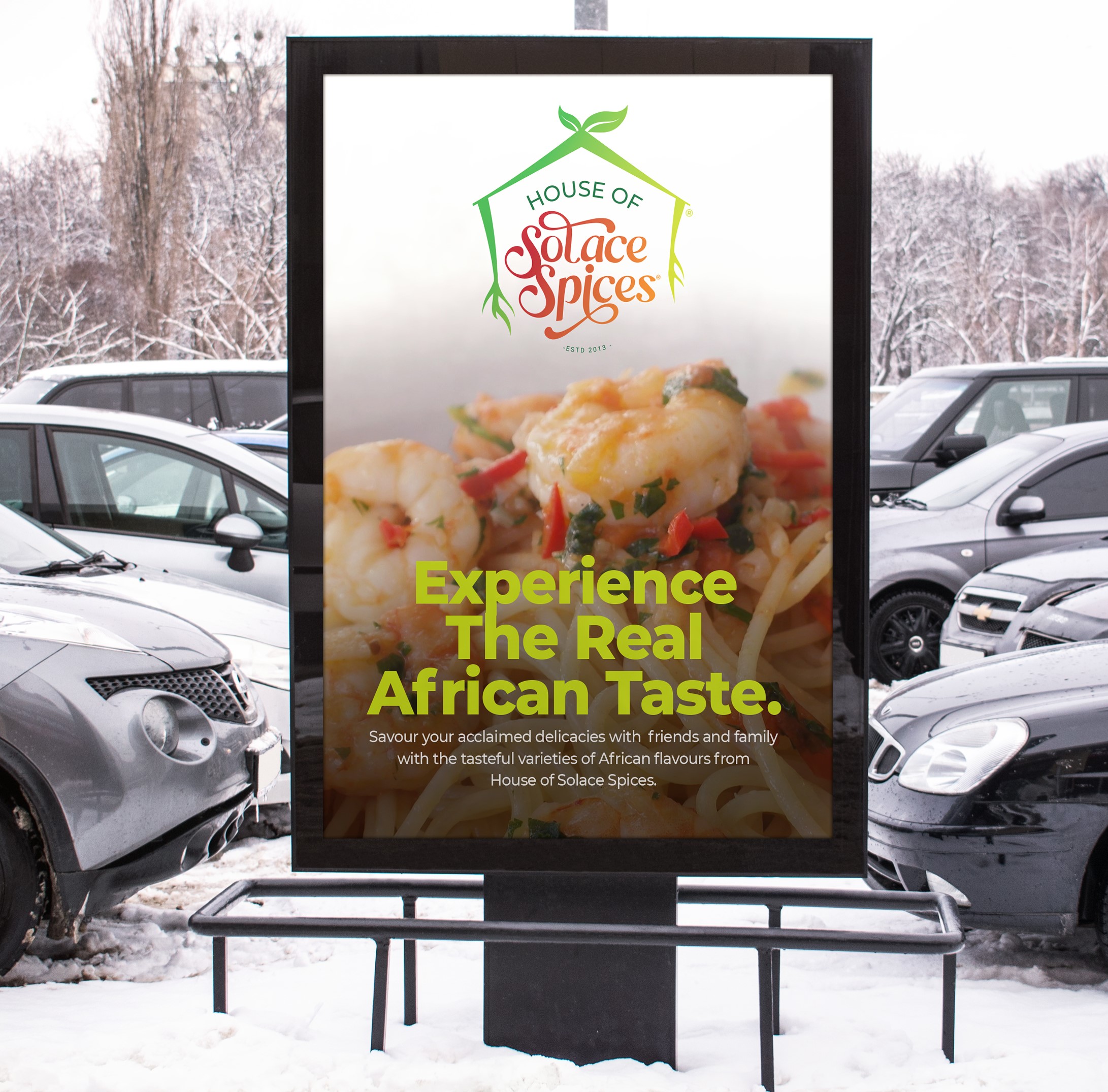
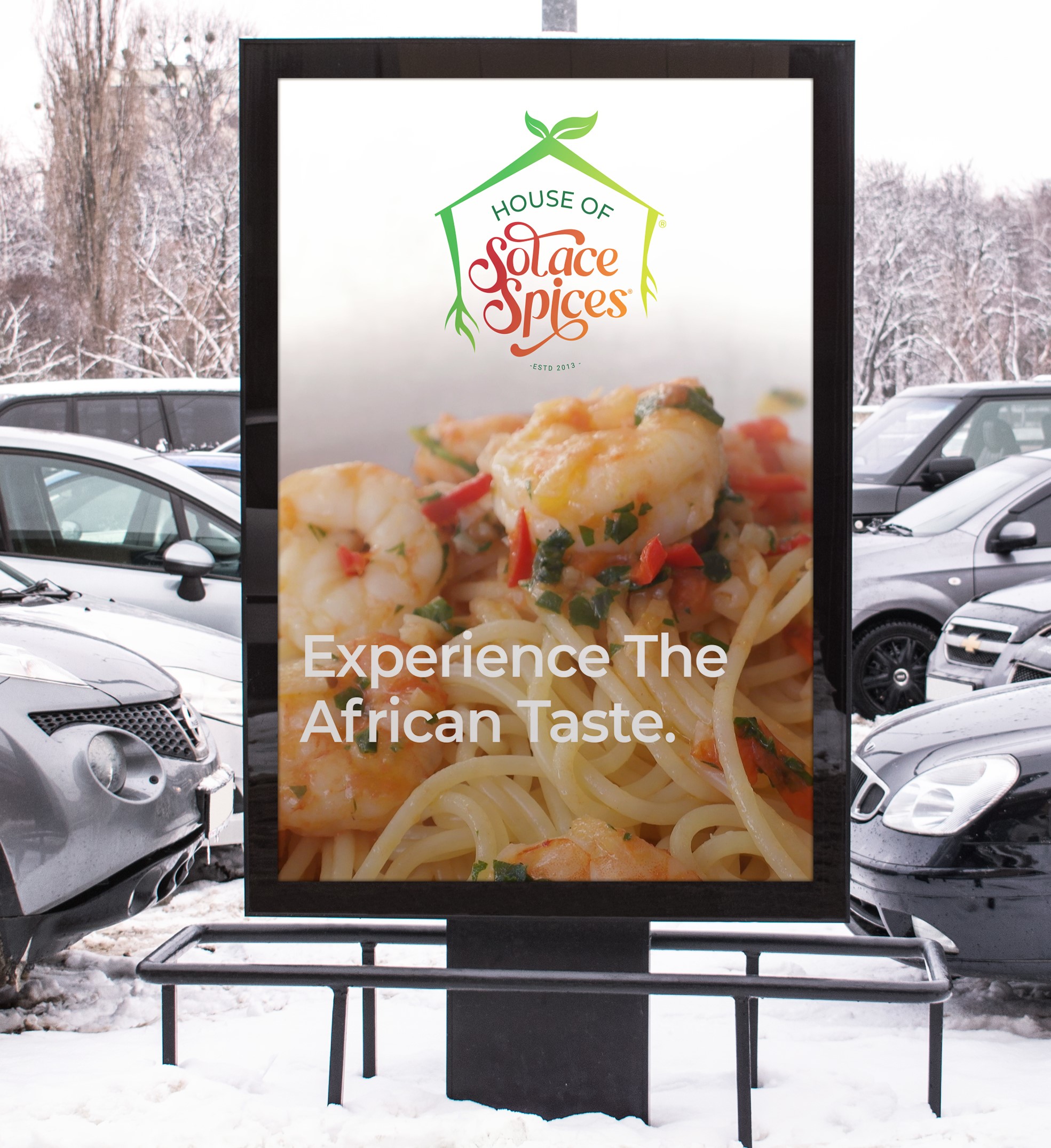
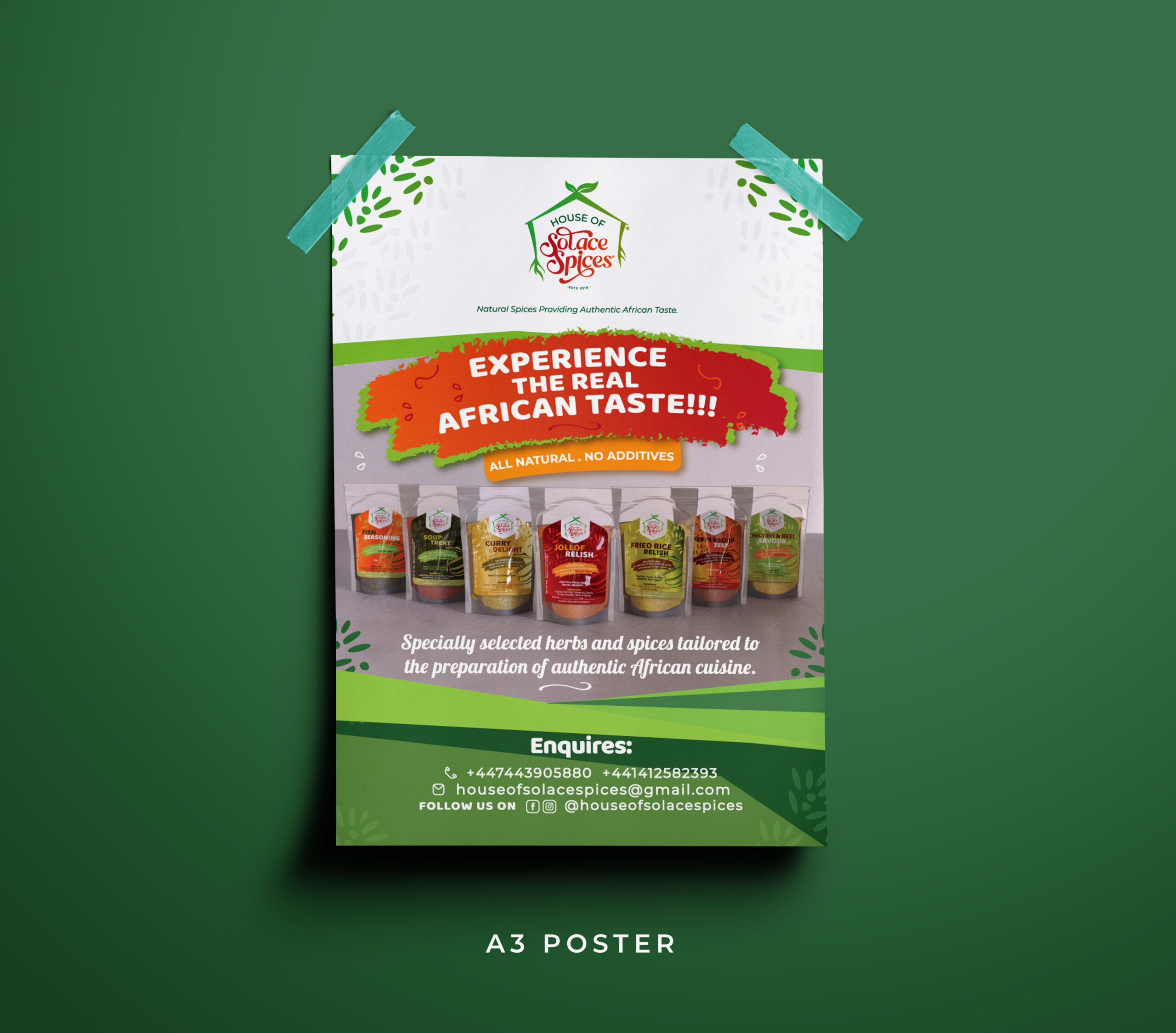
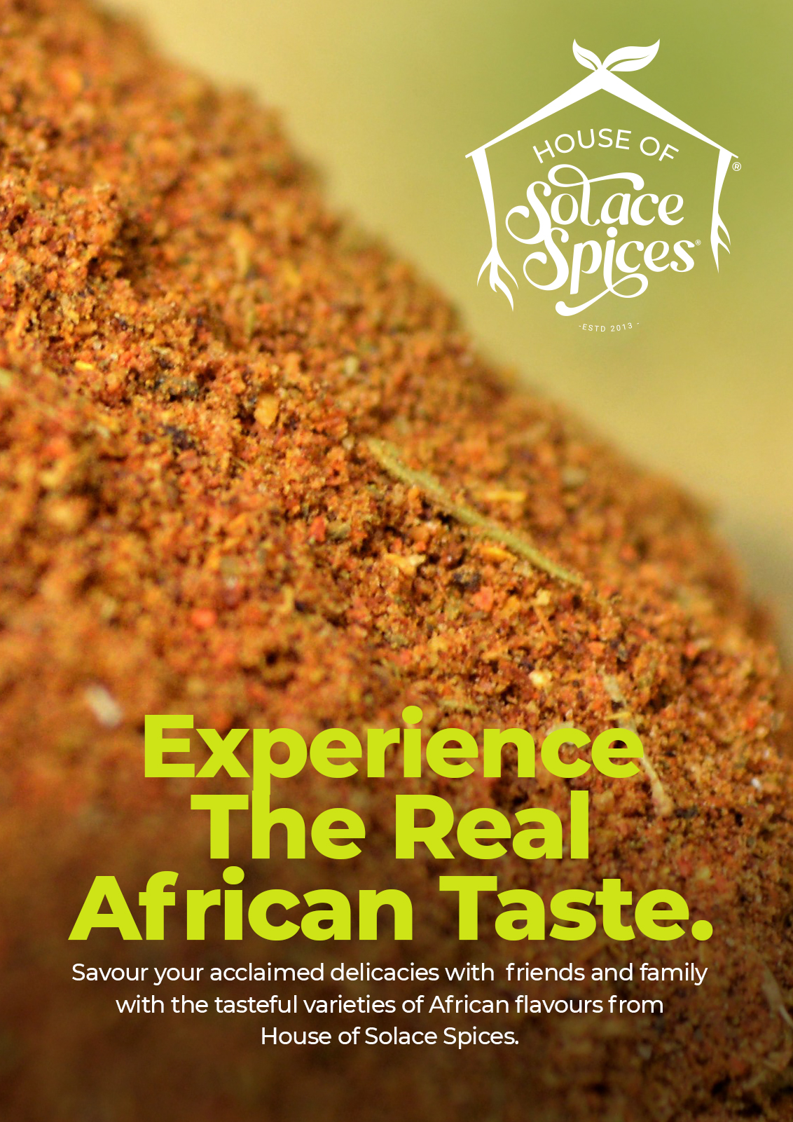
We designed a visually captivating poster, flyer and sign post displaying their authentic spices, captivating package design and appetizing food imagery. The design aimed to evoke the senses and entice customers to explore the authentic African taste.
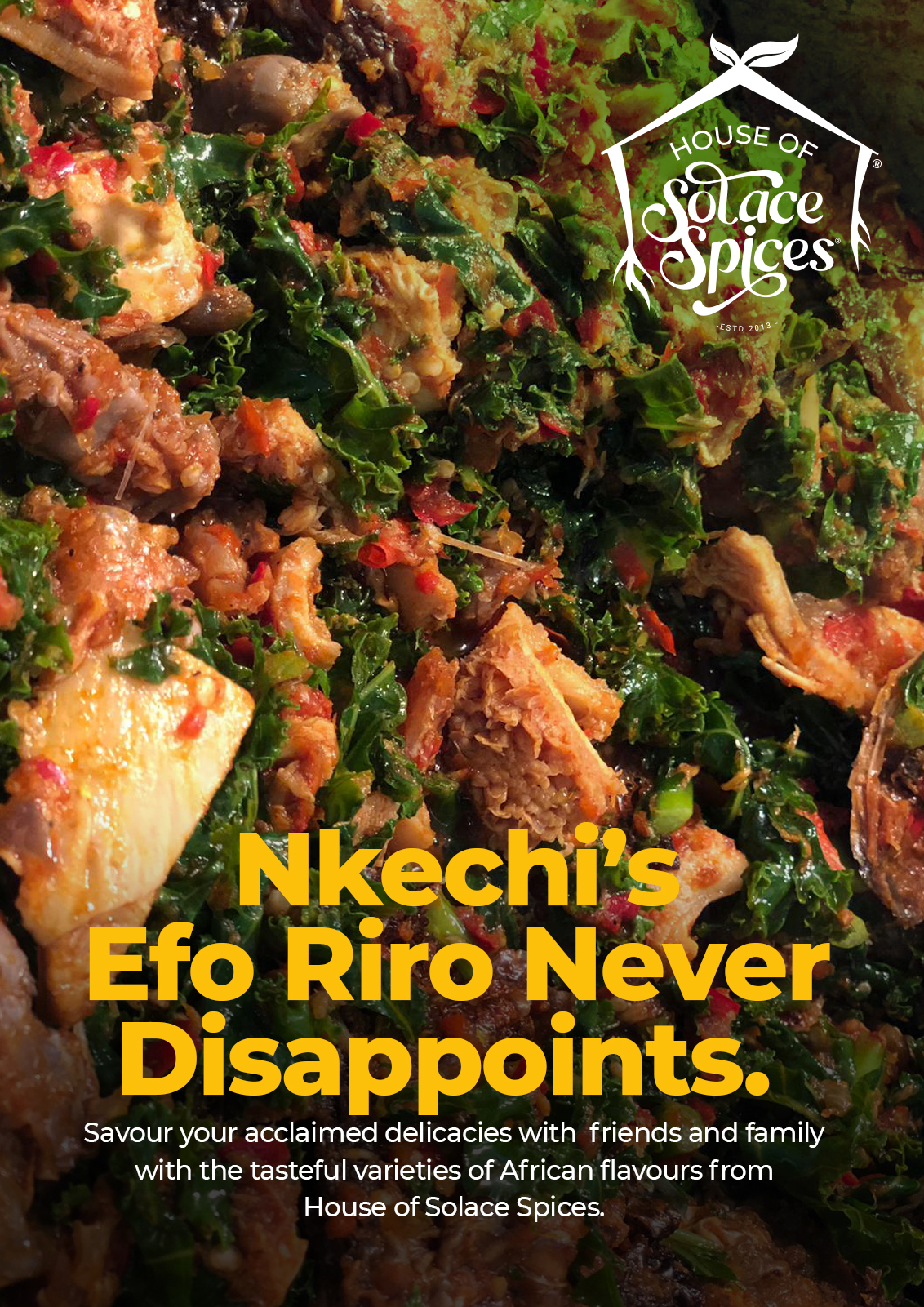
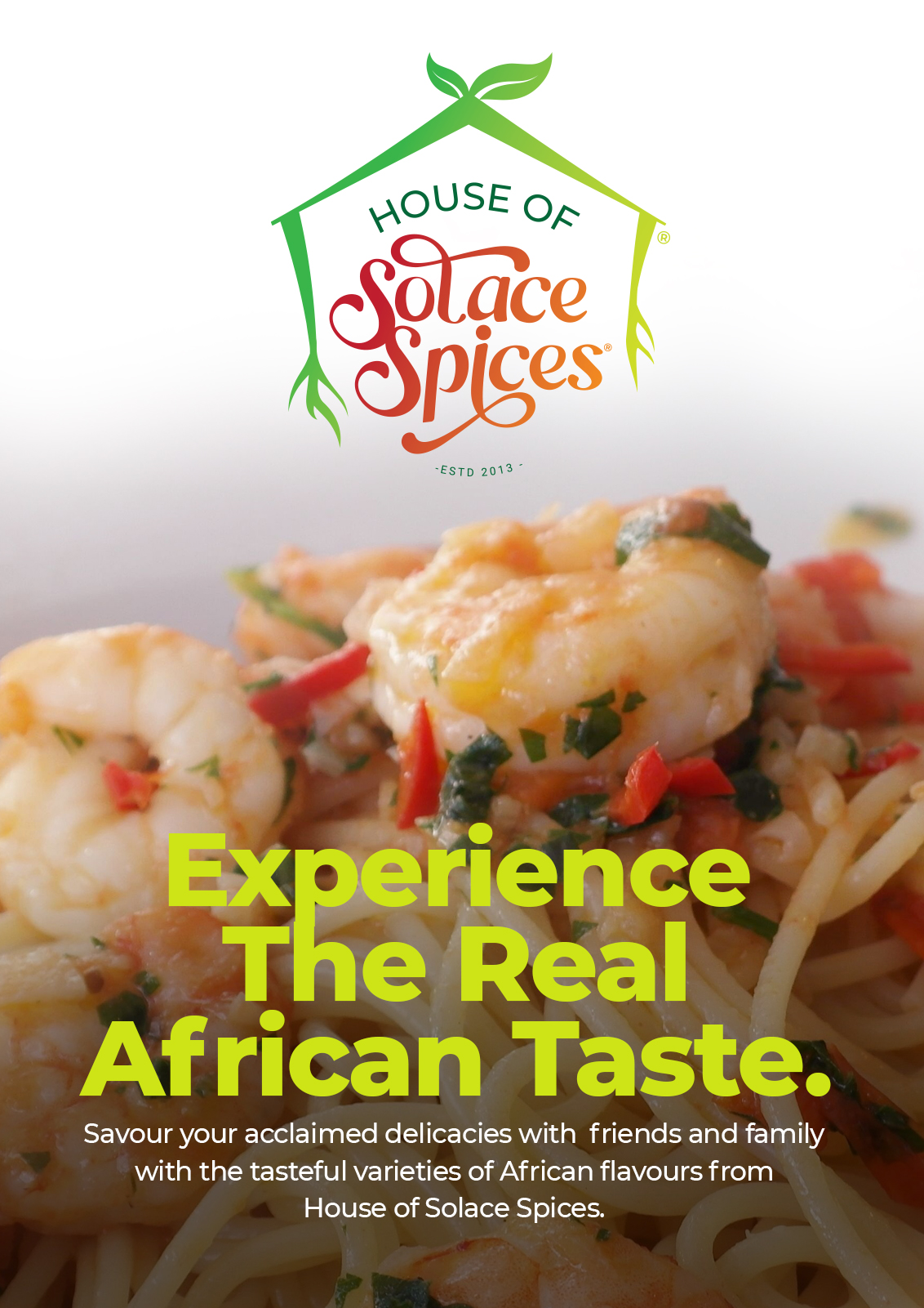
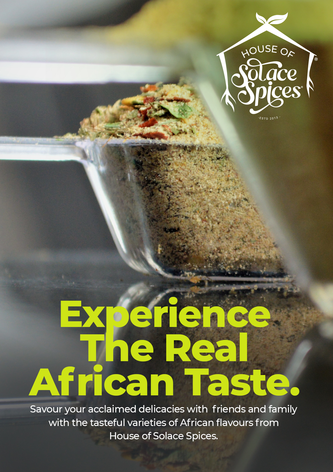
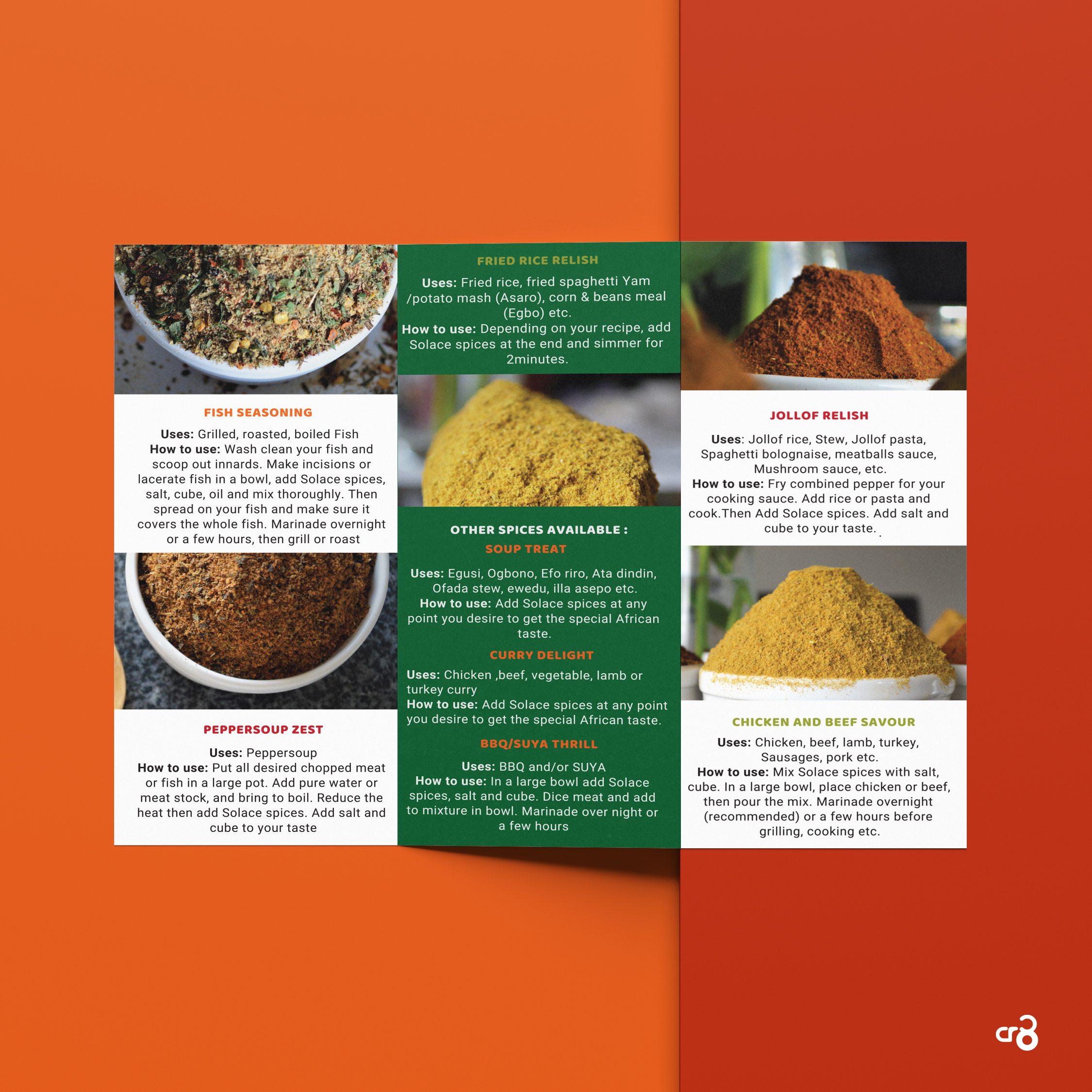
We developed a visually appealing and informative spice menu design, showcasing the variety of spices offered by House of Solace Spices. Each spice was presented with enticing imagery, descriptions, and suggested uses, providing customers with a comprehensive overview.
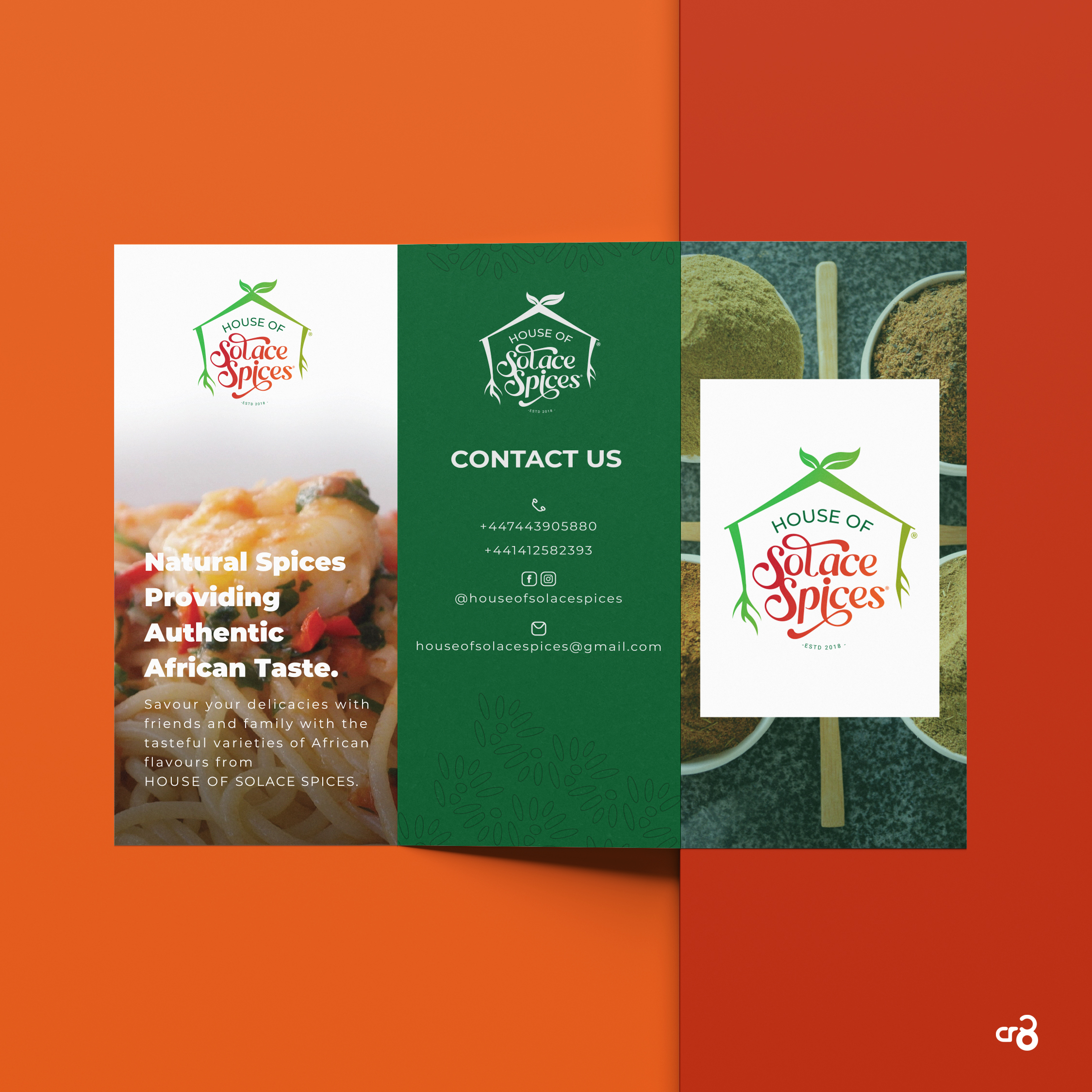
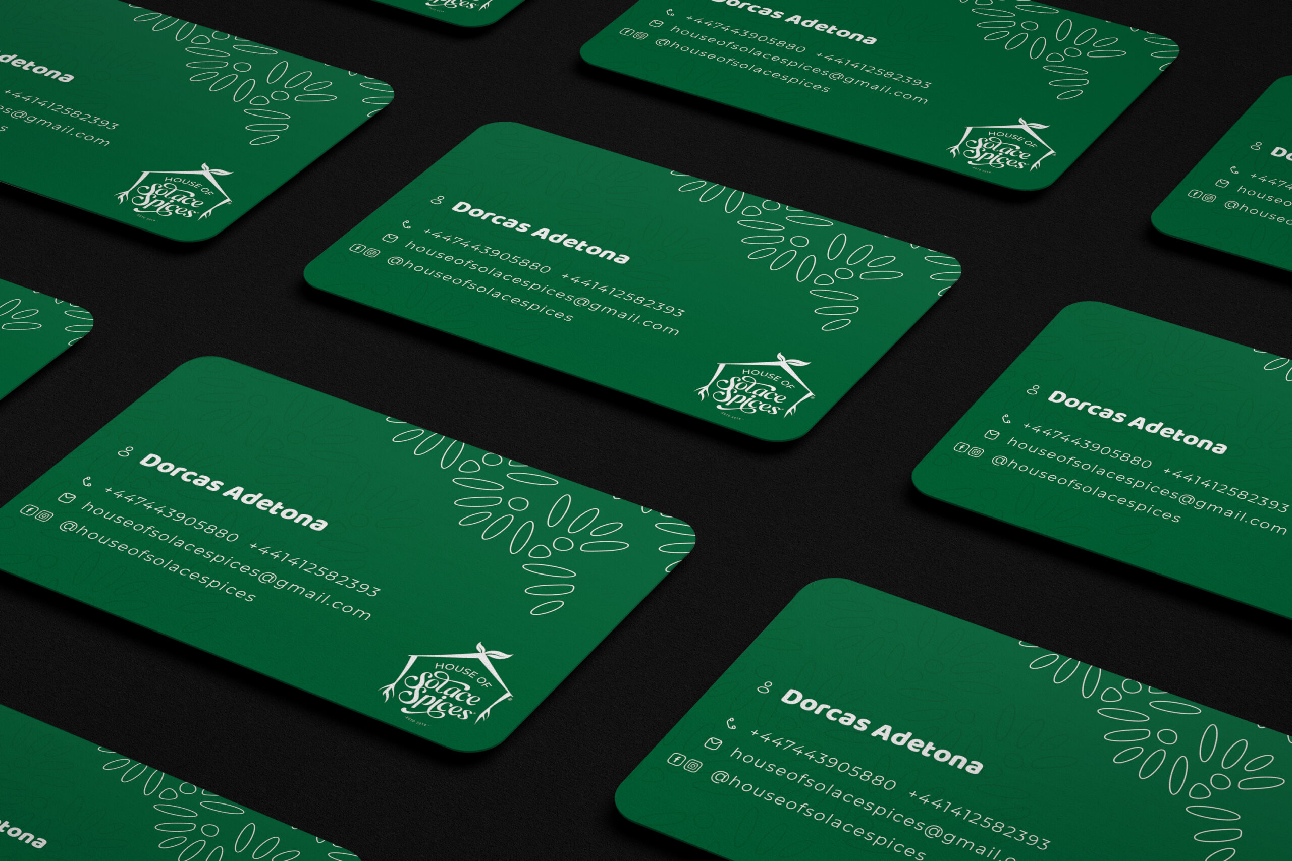
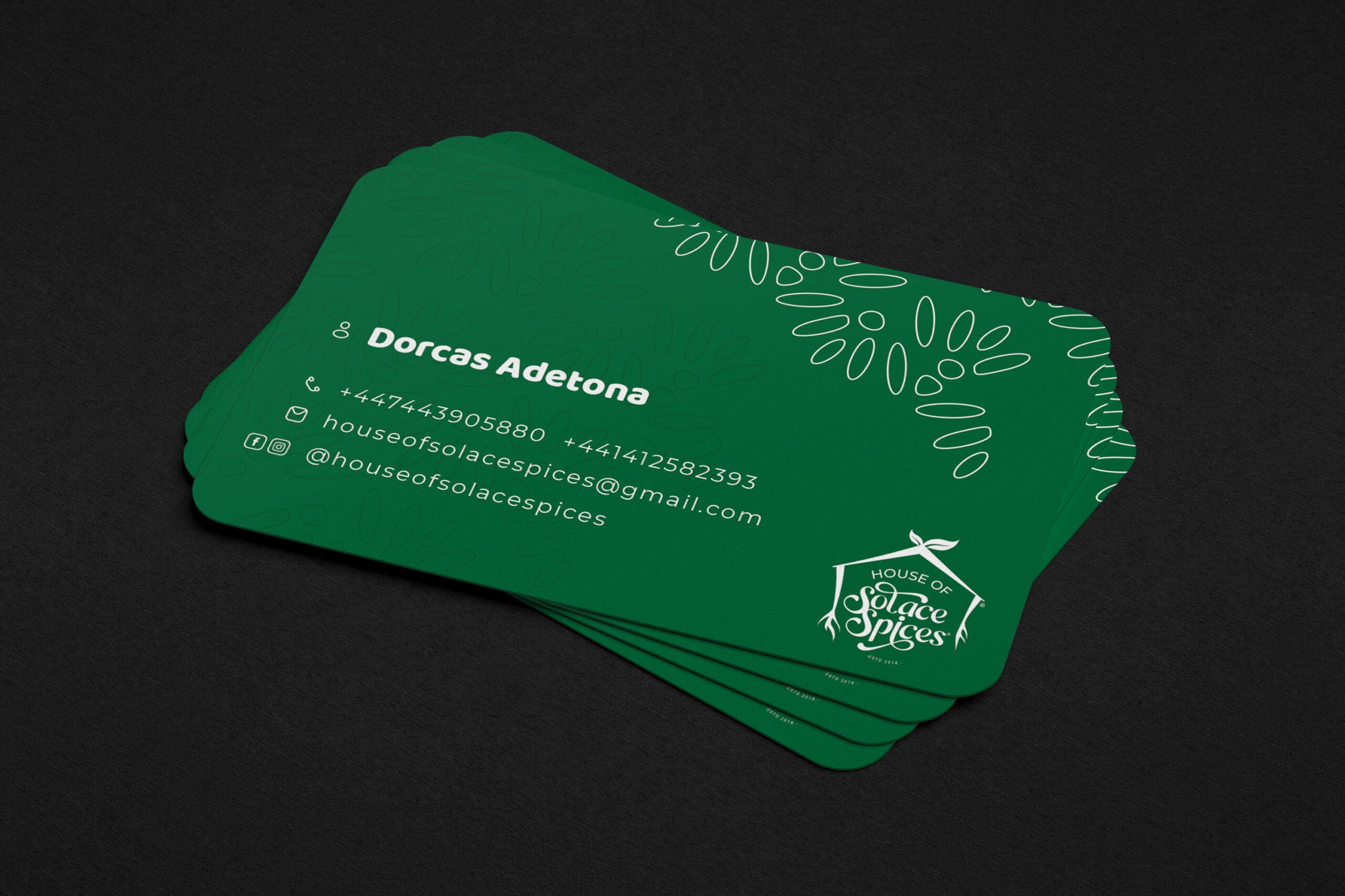
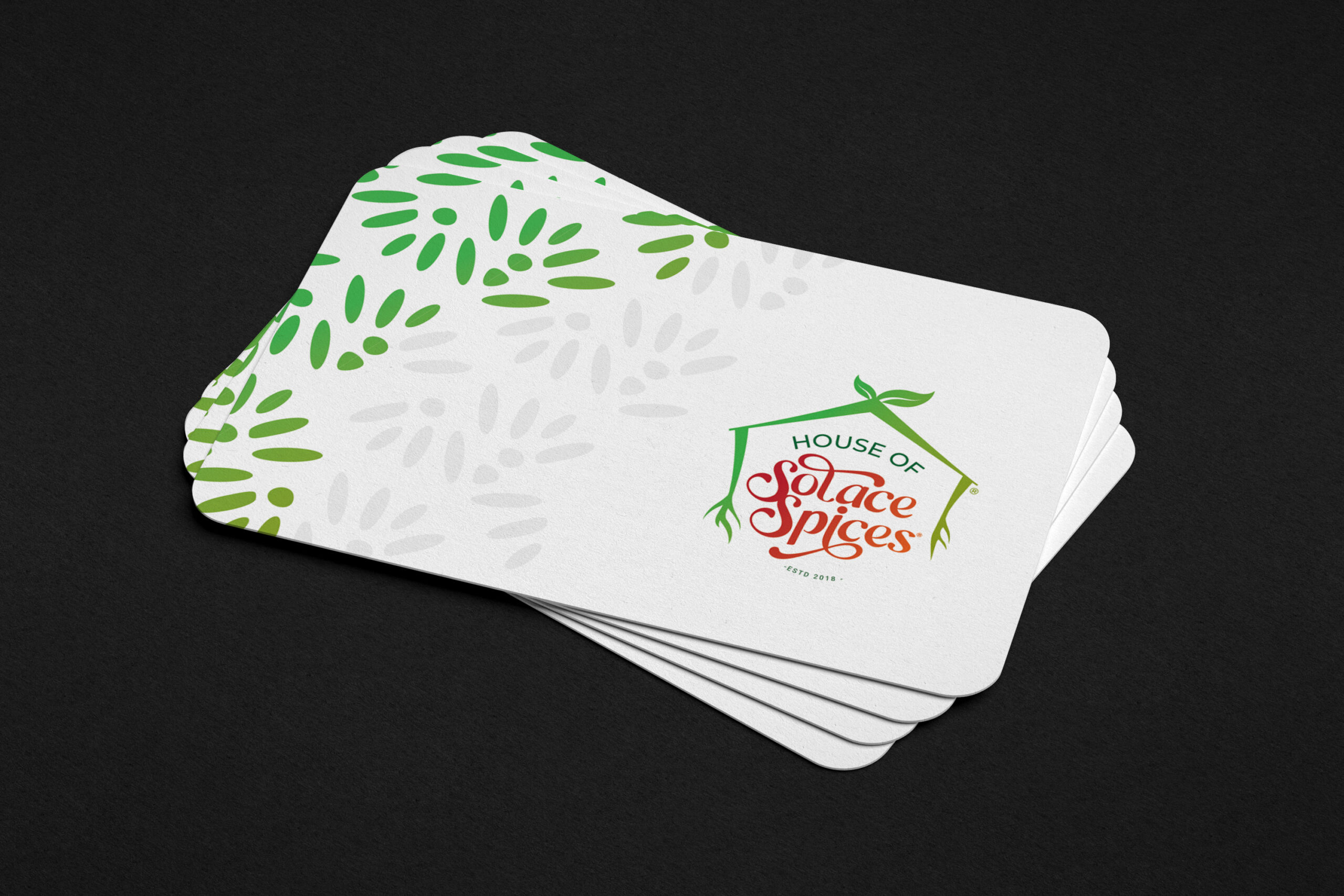
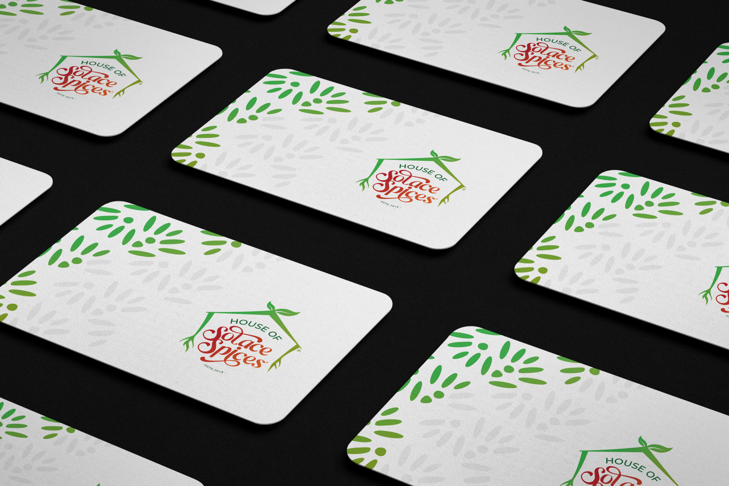
The business cards feature a simplified version of the logo on a clean and professional layout, we also made sure to include their brand patterns ensuring brand consistency, and providing contact information for potential clients and partners.
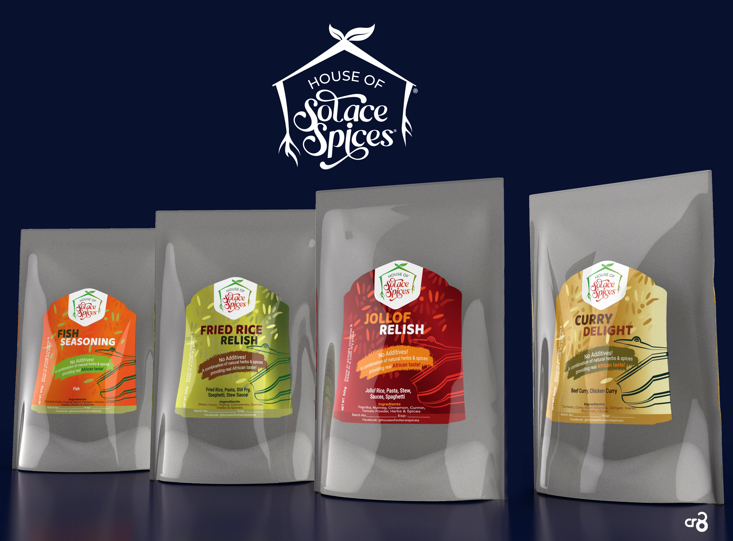
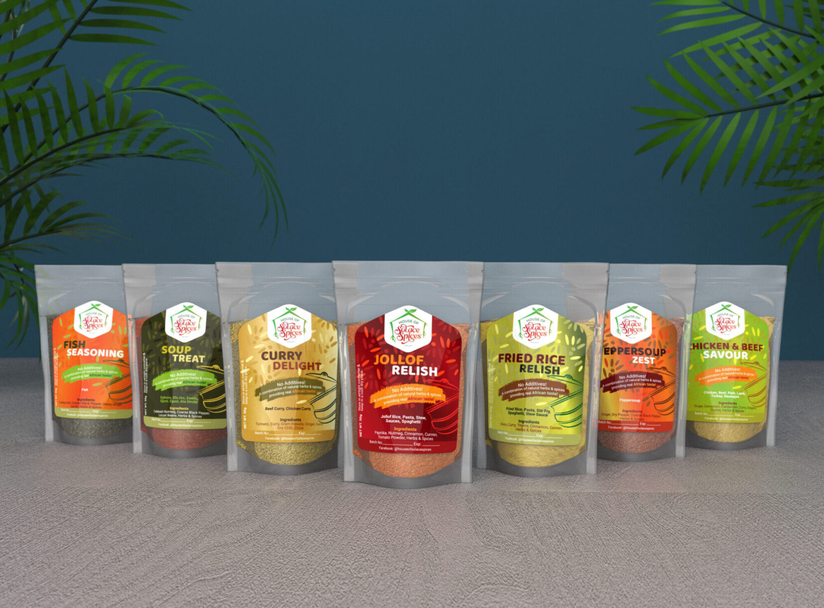
For the spice packaging, we created an eye-catching transparent Ziplock pouch that incorporated captivating designs with vibrant colors for each spice variant. The design aimed to stand out on shelves and convey the brand’s commitment to quality and authenticity.
Merch Design
